Data Visualisation for IoT: Making sense out of your data


For many, IoT is only about collecting the data. But just raw data is of no use. It is not going to help you improve your bottom line unless it gives you actionable insights.
It is not about the data, it is about the story that your data tells.
One of the great ways to get insights from the data is using data visualisation techniques. As a kid, I remember being told about this technique where you imagine complex formulas and numbers in the form of images. Visualisation helps remember things in a better way.
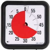
Recently I found an interesting device that helps you improve productivity by visualising time. Time Timer, as it is called, helps me not just know the time left but show a pie chart to give me a sense of time running out. Thus improving my productivity. In fact, I am using one right now while writing this blog.
I love this Ted-Talk by David McCandless on data visualisation. He speaks about how the bandwidth of sight is way more than touch, hearing and smell. Visualisation helps us collect much more data in a short time and more importantly learn from it, get insights from it.
When you collect the data for IoT, Data Visualisation, is one of the simplest and yet powerful tools to get insights. Below is an example of data collected by one of our client Pharma company to monitor the temperature levels in their manufacturing facility. We are using the data with their permission.
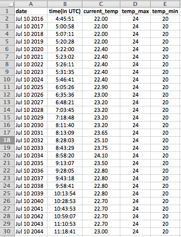
These are just 30 points and yet to find out at what time the temperature crossed the threshold (Shown by Temp_Max and Temp_Min) will take you a few seconds at least. The problem gets multiplied when you have millions of data points. Now check out below the data shown by the Bolt cloud’s data visualisation system.
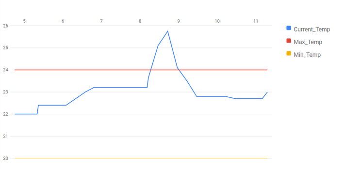
It takes you a maximum of 1–2 seconds to know when the data crossed the threshold. The CEO of the Pharma company then went on to speak to the floor manager for that particular shift to understand the reason for the spike in temperature. It turns out that there was a fault in the cooling system which was immediately rectified.
In cases like this, data visualisation can save millions of dollars for your company.
Data visualisation is inbuilt for the Bolt cloud. You can easily view the graphs of your data with suitable threading. We also have an option of dynamic thresholds which change with the stage of the process.
In addition, to the data visualisation, our IoT platform Bolt provides you with WiFi/GSM chip to connect to your sensors/actuators and also a cloud platform for storing the data and analysing it. Bolt helps enterprise and makers to easily and quickly build IoT products and services. Visit www.boltiot.com for more information.
If you are you looking to build an IoT product or looking for an end to end IoT solution for your company then we will be glad to speak to you and guide you on how to go about it. Please fill a short form at https://www.boltiot.com/#contact and we can schedule a call.
Comments are currently unavailable. Please reach out to us at support@boltiot.com